Archives For typography

I’m currently basking myself in the beauty that is Henry Huo’s (霍尊) first full-length album Heavenly Song or Tianyun (天韵). He was the winner of the first season of Sing my Song (中国好歌曲) when he cause a ruckus with his song Rolled-up Pearl Curtain (卷珠帘) [1], which he ended up performing at the 2014 CCTV Spring Festival Gala.

henry-huo-zun-tianyu-heavenly-song-album

You can listen to the album over at Xiami or Migu Music (for US locked).

Lyrics, English/Español translations and song embed below the break~

Once again, all Chinese translations by me to be taken with a pinch of salt. xD

Continue Reading…

Of course I need this in my life~

When I visited China — already nearly a decade ago — I got myself a seal with my name on. It’s made of jade, square, and it’s pretty big, to be honest. I’m also not fond of the font used, so I scanned the print to illustrate it and did a digital seal of my own that I use to sign photographs and whatnot. But ever since, I’ve wanted to get a new proper seal. I’ve only got my grandfather’s old seal.

Though most websites dealing with Japanese seals (hanko) look sketchy, I finally ran into Hankoya.com — I didn’t know they made titanium seals! Woah~ The website is, of course, so chunky and hard to browse if you can’t read Japanese. I doubt they’d do international shipping.

But~ my gosh~~~ they even do silver and gold seals! There’s also wood ones (like maple or sandalwood), but how sketchy is it with ivory and horns? Is it legal to even sell anything remotely done with ivory?

The amber resin and the Satsuma cornus kousa (薩摩本柘) look so good too~

… and in the process gets to remind me of Dido, for some reason.

Tizzy Bac vocalist Chen Hui Ting is set to release her solo album 21gr. (21克), which includes this song titled Set on Fire. The video is directed by Lin Hui Bin (林揮斌)… but I’m unsure if he did the light painting or just put together the video.

I always have such respect for people that light-paint in Chinese characters or Arabic. Haven’t run into people using Devanagari or Sanskrit or any other non-Roman script, though, that’d be really interesting.

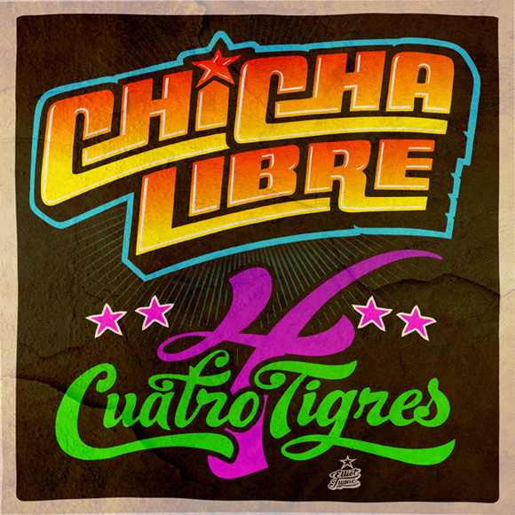
I was browsing albums, when I stumbled upon this album cover by Elliot Tupac.

chicha-libre-cuatro-tigres-elliot-tupac

Of course, for those in the know, you’d know that’s a super Chicha style type of typography [1], so interested to see what it was all about, I did a quick search. You’d be happy to know you can stream all of the EP Cuatro Tigres on Soundcloud, as well as their new album Canibalismo. Chicha Libre is a multi-ethnic Brooklyn-based group formed by Americans, Mexicans, Venezuelans and French musicians mixing Peruvian Chicha music with 60s psychedelic music and stuff. It’s pretty trippy.

I never in my life would’ve thought that I’d be sitting through more than one album of Chicha music. The most interesting thing is that there’s no Peruvians in sight on core members of the group. You can check them out on Facebook or Twitter. I’m not entirely a Chicha convert, but I appreciate the variety in the concept of the group. I do think they sound a lot like Chicha groups, but sing in English instead. Novelty, but it gets a bit tiring by the fourth track.

Conveniently, the group was asked to do a The Simpsons tune for one of the episodes.

[soundcloud url=”https://api.soundcloud.com/tracks/81093323″ params=”color=ff0090&auto_play=false&show_artwork=true” width=” 100%” height=”166″ iframe=”true” /]

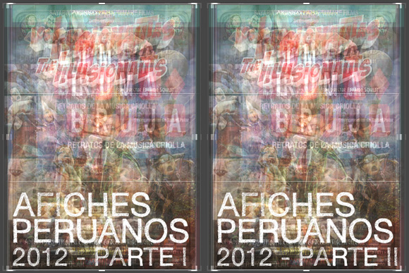
I think we missed the look at Peruvian Posters of 2011… but, oh, well~~~

Here’s this year’s look!
Part I – but there’s no post helped by Google Translate. xD
Part II – Google Translate

Sorry, no translation this year.

You can check previous posts on Peruvian Movie Posters here:

Continuing with our talks on Peruvian posters of 2010, we’ll continue with the smaller productions of 2, 3, Kasa Okupada, El Niño del Cusco, El Ultimo Piso and Vivir. If you’ve missed the first part of our discussion, head over here.

Obviously, because we are talking about more independent flare, instead of suggesting fonts for buying, we’ll be suggesting -if we’re suggesting any- free download fonts. Now, because these are completely independent, I have no idea where to watch them or have no idea what these films are about.

Also in Espanol at Cinencuentro~

Continue Reading…

Welcome to our second edition of Peruvian posters, if you’ve missed the first post on 2009 posters, you can check it out here — sorry, only in Spanish. There’s been an increase on Peruvian releases in the local film market that includes properly-Peruvian independent productions, as well as international co-productions.

Thanks to this, there has also been an increase in interest for marketing campaigns that include websites, social networking sites, and yes – posters, to make your film stand out from the bunch. The film poster culture in Peru hasn’t really exploded — in quantity or quality — , as marketing people and CEOs are still too scared of too much blank spaces or much too abstract concepts that may or may not confuse its audience.

We are still far from the less-is-more concept seen many-a-time in European or Japanese posters, and we are even farther from the mass-production of poster design that exists in the United States, but we’re taking baby steps as young people show more interest in design, and new designers get into the market.

Due to the number of posters this year, I’ve decided to split them into two groups – the first one with the “bigger” productions, and the second one with the independent productions. All will be listed in alphabetical order.

Continue Reading…

My friend sent this over to me, Crap Logo Yourself~

So I made a new YAM Mag logo! Yeah… right~~~

Also! MySpace getting a new logo?

Continue Reading…

Is it time to watch it yet? When is it coming out on DVD?

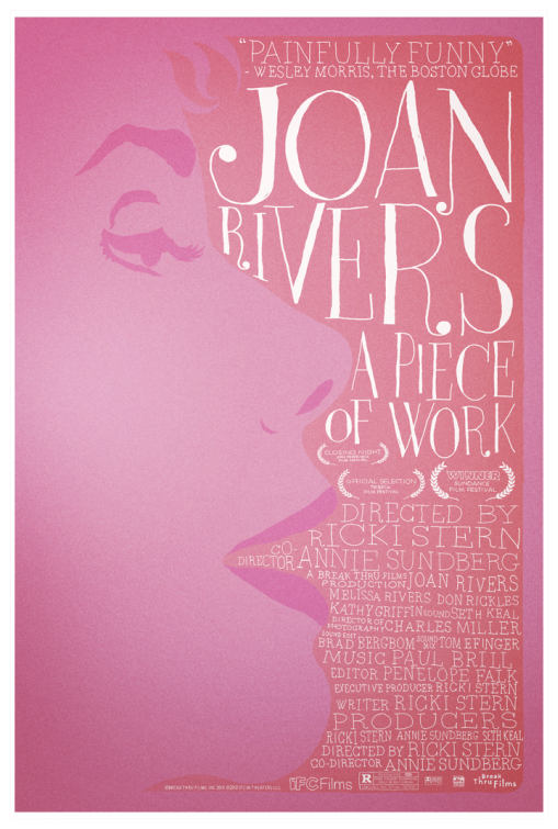
This is a gorgeous poster, isn’t it?

xD

I’m of the generation that grew up with Rivers’ red carpet events xD

Ahhh… classy song. No, really… it is a really classy song, which happens to have F*ck You every time the chorus goes. It seems like it’s been ages since a song sounded this classy with a title like this.

And it’s the dude from Gnarls Barkley… from that song Crazy~ He’s going solo.

But still, the typographical non-official version is cooler.

Maybe that version could be Best Typographical MV of 2010 ;P