Ahhh too many posters – a few highlights.
First, the poster for Burlesque beats the Teaser poster for it. Because I like Hot Pink on high contrast black and white. So I’m biased… Plus, I don’t think the trailer looks that bad.
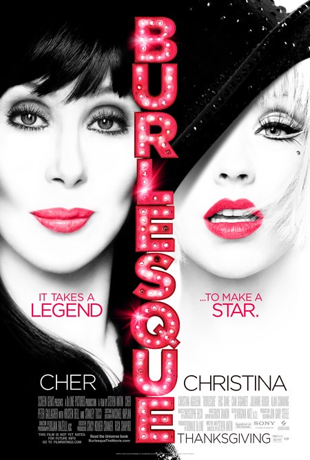

Ahhh too many posters – a few highlights.
First, the poster for Burlesque beats the Teaser poster for it. Because I like Hot Pink on high contrast black and white. So I’m biased… Plus, I don’t think the trailer looks that bad.

There’s a very great interview with Bruno Maag about his er… dislike of the use of Helvetica. I, for one, don’t mind Helvetica as you can see, but I try to use other type when it fits. A friend of mine told me “When in doubt, use Helvetica”. I personally agree with Maag when he talks about Univers, it’s very clean and very helpful for reading. I also think that Helvetica’s quirks gives it the warmth he mentions.
Patrick Burgoyne: Bruno, where does your deep-seated hatred of Helvetica come from? Isn’t hating Helvetica pointless? It’s like air or vanilla ice cream, it’s just there…
Bruno Maag: That’s the point, it is vanilla ice cream.
My fave type is Futura, though. I like the roundy-ness xD
But when it fits, it fits. LOL
Read the whole thing over at Creative Review.
The look amazing [the whole set], but my favorite was American Beauty because of the colors used, it just stands out on that set because of that.

Look through the whole set here.
Thanks to Mirella for the link. ;P
Jean-Sébastien Monzani just uploaded this gorgeous video that makes you think about the things you love… the simple things you love. Hmm… the video is kind of interactive, in a very basic level. xD
I love the sound of dried leaves when you step on them.
I love the smell of newly-printed material (books, magazines, cd booklets) xD
Those are my two fetishes…
This gorgeous info graphic — it’s hot pink! — is tied-in with the documentary Waiting for Superman, which talks about the education system (or not-a-system, if you’d like) in the USA.
The animation is done by Jorge R. Canedo Estrada, who studied in the Digital Design program at VFS ;O
[iframe src=”https://player.vimeo.com/video/12677264?byline=0&portrait=0&color=7dce57″ width=”560″ height=”315″]
Can I just say it?
Holy Sh!t~ that’s amazing!
[iframe width=”560″ height=”349″ src=”https://www.youtube.com/embed/pHl8UEewbN8?rel=0″]
Visit PilotHandwriting.com
=D

Created by Vladimir Loginov and Maksim Loginov.
I am pretty sure I’ve seen their work before, but couldn’t find it on the site, so posting~
via Trendsnow.

