Most people know I’ve cut most (if not all) my ties with Harry Potter fandom — thank Kamisama! Where would my life be otherwise? — Anyway, I ran into these covers re-designed to look like Classic Penguin Books. These are oh so pretty!
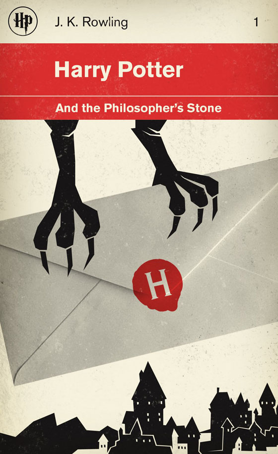

Most people know I’ve cut most (if not all) my ties with Harry Potter fandom — thank Kamisama! Where would my life be otherwise? — Anyway, I ran into these covers re-designed to look like Classic Penguin Books. These are oh so pretty!

why is that? how is that?
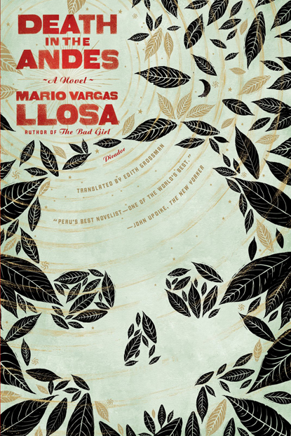
I’m not particularly fond of Mr. Vargas Llosa, but I ran into these covers, which are way cooler than the version of his books that I’ve seen lying around bookshelves.
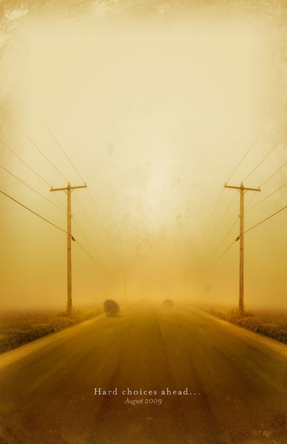
Just finished browsing through my Communication Arts issue, and ran into these posters for TCM and their classic film line up for the summer, which I thought were pretty cool.
Created by JWT making contrast between the beautiful traditional Chinese landscape paintings, and industrial living. These are gorgeous~~~

I know this looks cool, but can you read anything on it? xD
[iframe src=”https://player.vimeo.com/video/3302330?portrait=0&color=ffffff” width=”560″ height=”315″]
Since I’ve been jealous that my friends Turtle and JK are taking some really good typography classes, I have told them they can review their classes and assignments with me… that way they learn, and I also get to learn. xD
Anyway, JK referred me to FontStruct, which I had visited once after they showed up on a Communication Arts issue. However, I was to shy to try it out — I mean, that introductory quick animation seems a bit pro. But in the end, JK told me I should check it out because it was interesting, and his teacher like it quite a bit.
So I ended up playing with it to create a pixel-based font. I started out with my KATAKANA alphabet, which has some very nice forms and some very hard to do~~~ This pixel font also works for typing in Spanish, French and Swedish =D
Sorry, no Hiragana at the moment.
Plus, Photoshop doesn’t seem to recognize the Japanese input, and just uses the default font for Japanese characters. What’s up with that? Does anyone know?
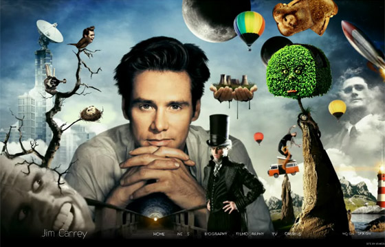
First, I have to admit something. I used to find Jim Carrey kind of attractive. LOL – There, I said it. I don’t care, most people I know don’t read this blog anyway. Hahaha. But Julz does, and I know she’ll probably have a field trip with this. She will either admit a crush too, or point it out from here on to make fun of it for the rest of my life xD
Anyway… website talk! I haven’t fully navigated through it because, either my internet connection is REALLY and I mean REALLY slow today, or this website weighs a ton because it took me 3 refreshes and more than a 2-minute load to just have the website appear. I mean, seriously~~~ 3 refreshes for the loading page to appear?
But still, I like the look. It’s pretty. I know. But navigating through some of the sections, I just tried clicking on stuff, but things took ages to load — I mean, I know. I get it, the transitions are nifty. But I don’t like waiting for my transition to load, you know? Waiting and then find out it’s just a transition?
Check it out yourself at JimCarrey.com
Will navigate through it later in the night, or over the weekend. Hopefully, it’s just my internet connection. How can it be? I hate telephones and mobiles, but can’t live without the internet. xD
Late post! Internet issues! But it gave me the time to watch this awesome kick-ass animated film that apparently was released early in the year, but I have heard nothing about it. So Amy do, as Amy does.

I am pushing for a nomination, ha! Here’s a brief write-up:
I just saw the best animated film I’ve seen all year. A stop-motion funny, yet compelling serious drama about the unlikely friendship between one cute, albeit kinda weird, 8-year-old girl in Australia and some 40-something-year-old Jewish/Atheist man living in New York.
You should all try to check it out, even if it’s online because if it weren’t for the internet, I wouldn’t have EVER heard about it.
Now I’m pushing for a nomination… AT LEAST a nomination. We all know Pixar’s UP is a lock on it, and will probably win (boooooring), so I’m pushing for Mary and Max this season.
If it gets a nod (very unlikely, since there’s no marketing or buzz), I will die of happiness~~~ xD
My favorite font! and Johnny Cash! xD
[iframe src=”https://player.vimeo.com/video/7293141?portrait=0&color=ffffff” width=”560″ height=”315″]

NOTCOT got a sneak peek at the Absolut Icebar re-design. I was talking about it with my dad this passed weekend — talking about the iced-shots and how they would melt in this weather, so I ended up mentioning the icebars, and then he said how the people would complain is cold. I told him there are coats, and then he said that those must be stinky. HAHAHA.