Continuing with our talks on Peruvian posters of 2010, we’ll continue with the smaller productions of 2, 3, Kasa Okupada, El Niño del Cusco, El Ultimo Piso and Vivir. If you’ve missed the first part of our discussion, head over here.
Obviously, because we are talking about more independent flare, instead of suggesting fonts for buying, we’ll be suggesting -if we’re suggesting any- free download fonts. Now, because these are completely independent, I have no idea where to watch them or have no idea what these films are about.
Also in Espanol at Cinencuentro~
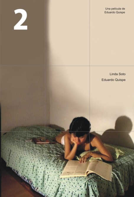
2 – dos –
2 takes the stylized “two” as a numeral in what appears to be Frutiger, though there’s nothing inherently wrong with it, they could have used the director and acting credits as more text elements. Moreover, since they’re only using “2” they could have picked a more interesting “2” character maybe from any of the weights on the Lane font or Cleanvertising?
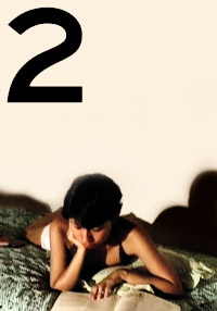
The composition in the image follows the rule of thirds fine, but the treatment of the image seems a bit dull. The color palette seems too opaque. As a result the image needs contrast, maybe with a closer crop.
Also, the fixing of the shadow so it fits the left third seems a bit on-the-go, as you can see the shadow line being fuzzy, while the roundy almost perfect shadow below seems to have been pushed into position with the smudge tool disregarding all the noise in the actual photograph.
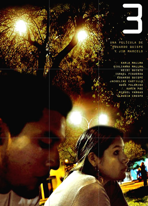
3 – tres –
3 takes the stylized numeral “three” in what appears to be some digital-looking type. The result of the image treatment looks a bit amateur — there’s also the grainy quality from the ISO — because it’s obviously a composite image. You can notice the clean cut lines of the faces separating them from the blurry background, which even looks like a bit too much going on with the branches, the street lights and the street.
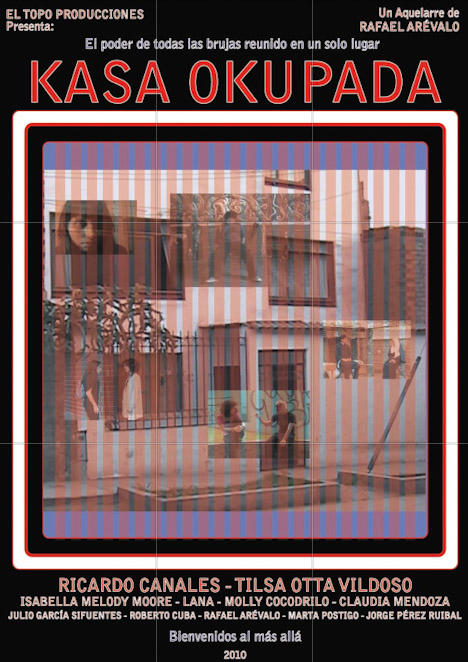
Kasa Okupada
The poster for Kasa Okupada is almost as design-offensive as the poster for Rehenes, using effects like “glow” in all their type, including the title stylized with “K”s instead of “C”s for Casa Ocupada. The image has a similar treatment to Rehenes in that it uses lines, even though it has a concept of looking through the walls… I’m guessing from the stills on top of the house.
The type seems to be a squished version of Bell Gothic, at least that’s the closest I could find. Having said that, if this is a horror film, all I see is red and blue.
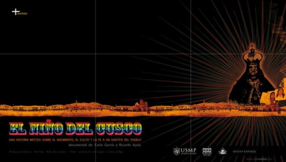
El Niño del Cusco
This is perhaps the most visually interesting poster, not because it sells us the movie. We have no idea this is a documentary until you read all the credits, but it demands your attention. The title is using Rosewood Regular, and is treated with the popular “rainbow” Incan colors, obviously linking it to the city of Cuzco — sorry, can’t type it with an “s”.
Composition-wise, it’s good and interesting in its new format with the most concentration of elements on the right third, while the “horizon” sits comfortably on the bottom third.
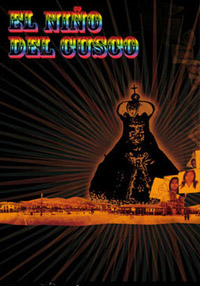
Perhaps the cloning doesn’t work that well, and the design would have benefited from a traditional poster size to avoid repeating the extending houses. Otherwise, well executed.
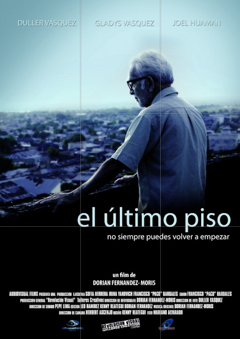
El Ultimo Piso
El Ultimo Piso’s title seems to be using Myriad Pro-Regular, and decides to stay away from centering its elements. The character is placed on the right third, while the title sits comfortably on the line of the bottom third.
The treatment of the image seems a little weird, I’m not sure where the light is coming from, since the light is hitting the character from the front left, but there’s some sort of halo around his head.
The blue tones makes it seem like the film has a sad ending.
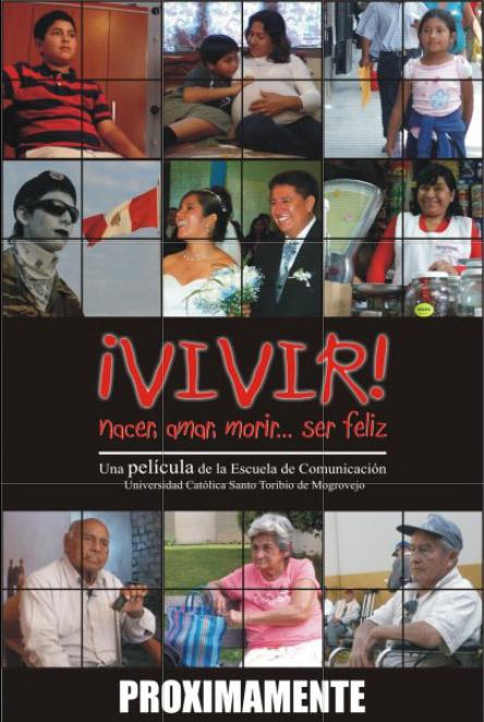
Vivir
At first sight, Vivir seems to be one of those anthology films with short films about people, and having the people — at least most of them — smiling, gives us the hint of a fuzzy happy film. Sure! It’s called Live! Be born, love, die… be happy, however, the colors are depressing. The only hint of “glowing” is that glow on the title, while also using three different types. One of them another unidentified handwritten font, what appears to be Times New Roman, and Impact.
None of the photos have been treated for color, so all of them look from different films altogether. We don’t know if they’re a collection of shorts, or a film with many different stories.
A poster for a movie called Vivir should be vibrant and full of life.
—
Well, here we are guys~ The last part of this 2010 Peruvian Poster review. The Cinencuentro team told me we were missing the reviews for some 2009 releases, so I guess those are bonuses!
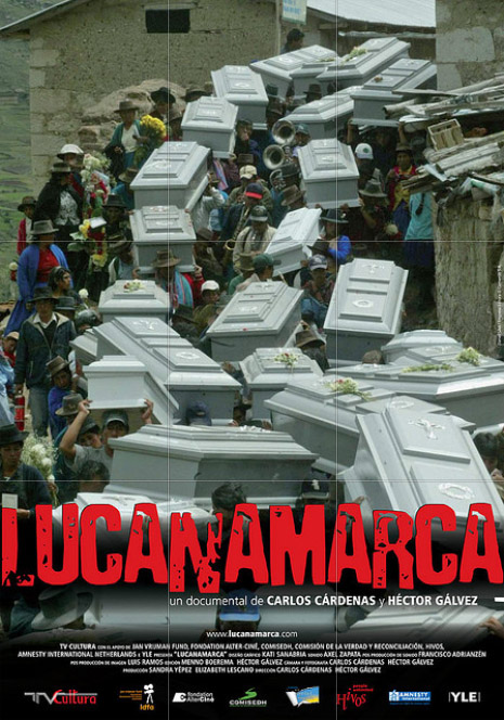
Lucanamarca
Lucanamarca’s poster with the trail of coffins is interesting imagery. Composition-wise, it does create a nice flow from the top of the poster to where the title is, though it seems to lack contrast considering the red they use for the title, which is treated with a stamp-like font that seems out of place, just as much as that black gradient behind the title to make it legible.
They should have used just black below to avoid that weird line left of the picture below the title.
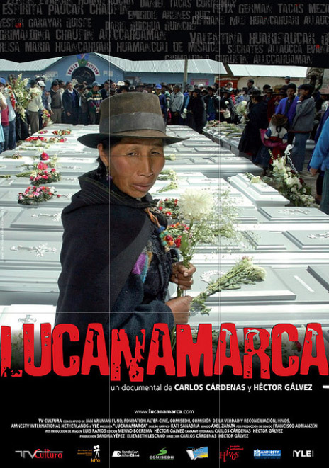
The other poster for Lucanamarca is a different story. The photo used is still an interesting image, with the coffins creating a pattern, while the woman stands there. A little tweak so the eye of the woman fits right on the bottom left third would be nicer, and if they could have gotten the woman to look straight to the camera in order to make the photo more engaging would have made the imagery ten times stronger.
Still not fond of that red.
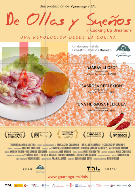
De Ollas y Sueños
When I see the poster for this documentary about the history of Peruvian food evolution, all I see is a problem with ego. Why? The first thing I read — besides the title — it’s Guarango and TAL production, once at the top. Then there’s the Guarango logo again on the image sector, then there’s both logos at the bottom… and finally, the TAL logo at the bottom with the rest of sponsors. There’s more attention to how many sponsors there are, than attention to the lonely ceviche on there, which by the way has a fancy geometric shape on top of it.
The illustration bellow is so poorly-cloned that you can see six duplicated bald heads.
If the documentary is as the quotes say “Marvelous” and a “Tasty Introspection,” I’m sure they could have conveyed a mouth-watering photograph of Peruvian food… even if “food” is a tough subject to put on a movie poster. However, you can hire one of my favorite Food Photographers~~~ Veronika Studer! [1][2] She’s got gorgeous food.
—
That’s it, you guys! Loads of tough work, but let’s hope it helps everyone for much better 2011 posters (and films)!! Don’t forget to complain about our thughts in the comments, and or stalk YAM Magazine over at Twitter and Facebook to tell us how much you hate us. We love some bad press. xD

