Welcome to our second edition of Peruvian posters, if you’ve missed the first post on 2009 posters, you can check it out here — sorry, only in Spanish. There’s been an increase on Peruvian releases in the local film market that includes properly-Peruvian independent productions, as well as international co-productions.
Thanks to this, there has also been an increase in interest for marketing campaigns that include websites, social networking sites, and yes – posters, to make your film stand out from the bunch. The film poster culture in Peru hasn’t really exploded — in quantity or quality — , as marketing people and CEOs are still too scared of too much blank spaces or much too abstract concepts that may or may not confuse its audience.
We are still far from the less-is-more concept seen many-a-time in European or Japanese posters, and we are even farther from the mass-production of poster design that exists in the United States, but we’re taking baby steps as young people show more interest in design, and new designers get into the market.
Due to the number of posters this year, I’ve decided to split them into two groups – the first one with the “bigger” productions, and the second one with the independent productions. All will be listed in alphabetical order.
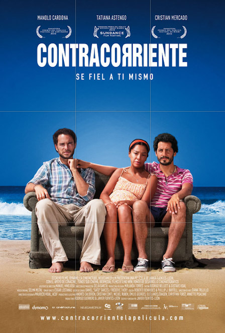
Contracorriente
The co-production of Contracorriente – includes Peru, Colombia, France and Germany – uses a simple yet effective centered composition. This is in part for the photograph taken specifically for the poster, instead of using a still from the film. It allows to put a lot of thought into the actual photograph to tell the story with simple gestures, such as actress Tatiana Astengo leaning on Cristian Mercado who plays her husband, who in turned is extending his arm to hold Manolo Cardona’s hand who plays his lover. We don’t even need the trailer to know what the film is going to be about.
The title is treated simply with Helvetica Compressed, and given a little tweak to inverse one of the “R” used in the title, something that didn’t really translate well with the title in English which has the only “R” in Undertow inversed.
Even the composition lets our characters sit on top of the bottom third of the poster. It’s not that interesting as a collectible, but it’s well executed.
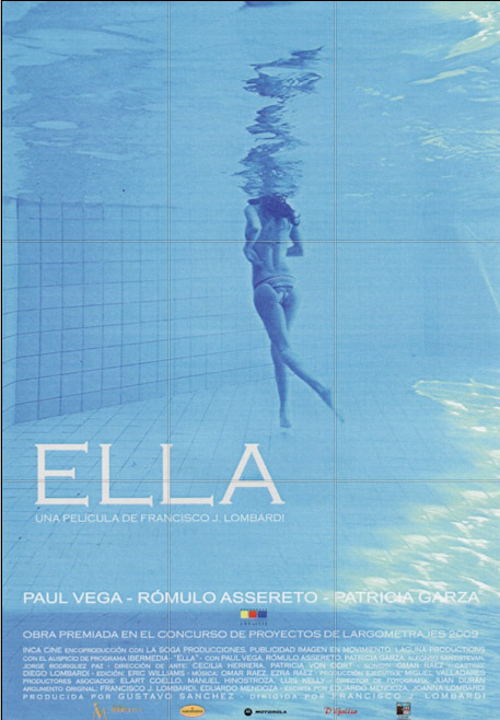
Ella
The recent production of popular Peruvian director Francisco Lombardi, Ella is a simple poster to look at first sight. It’s not clustered, the underwater image seems haunting – artistic for being a woman in a bikini, and as a poster hanging on a theater wall… it demands a certain attention, at least once. However, upon further inspection of the main image, it’s somewhat surprising to see they’ve used the “cloning” brush without any care. You can actually see the lines of the tiles not aligning, as well as the light shimmers repeating themselves. Moreover, there’s a terrible hard line that breaks the continuity of the image, as if the credits had been added as an afterthought.
And despite the team actually keeping continuity with the brand using American Gothic throughout the poster and the trailer – now, this is probably my fault for not watching the film, but American Gothic seems such a serious font for things like banks and finances, not a film about the loneliness of an artist. For something as naked as this image, maybe something cleaner… but not as strong – maybe something like Archive Atlantique for the title.
As far as composition goes, it seems to stay clear from centering elements, but leaves floating the title on the left bottom third, and the woman floating on what could be the middle of the poster. It’s just a little bit off.
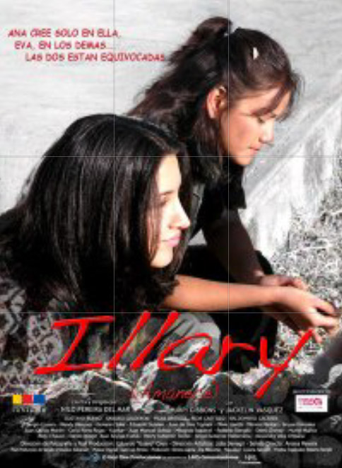
Illary
Illary’s poster is a bit tricky, being so tiny. The text seems to be using… *shudders* Comic Sans in red, while the title – The closest thing I could find to it on-the-go was Longhand, but I’m pretty sure that the type used for the title is one of those handwritten fonts on 1001Fonts.com, because I know I’ve seen that one.
The image treatment is poor, from whatever detail you can see in the blown-up version with guide lines. You can see the sharp outlines of the girls popping up from the background, and they’re placed just a bit off the thirds. The slogan of “Ana cree… etc.” is just hovering there, not aligned to anything. The second line of text is aligned to the second character of the first line, but the third line is aligned to the third character of the second line.
We can actually follow an imaginary “Z” from the slogan, to the girl’s hair, down the hair of the other girl, down that arm, and out of the poster.
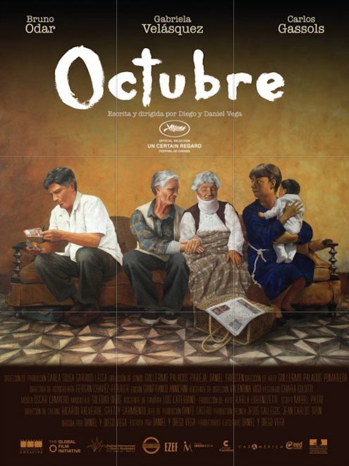
Octubre
The first poster released for the dark comedy Octubre includes an unusual illustration. We don’t have illustrations in posters in Peru, it immediately made it stand out. Sure, the composition doesn’t escape the ever-present centering, but the poster at least gives us the illustration, and the title treatment. Octubre seems to be finger-painted. Up until then, the poster is interesting. However, the use of what seems Parry Pro Normal or some typewriter font doesn’t really fit the concept of “hand-made”. Maybe a hand-written type would have worked better.
Even the composition seems to follow the thirds fine, with the couch lying on the bottom third, the characters on the middle, the Cannes “Un Certain Regard” graphic on the top third.
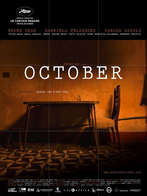
The poster in English, has lost the finger-painting for what seems… Courier, or some typewriter type, which is used in all the copy. The image is one of the stills included in the promotional pack, treated for a saturated orange. Not really as interesting as the first poster, but still able to keep some sort of composition with the title pushing for the top third, the red base of the wall on the bottom third.

The second poster in Spanish just confirms that Octubre has bad branding, the title of the film has yet another font – Bauer Bodoni? Adding a still of the film with the actors, some color treatment to the poster credits – once again, centered. Perhaps the worst in the not-a-series because it’s the weakest in composition.
Something to note is the inclusion of all the logos of all the production houses with their respective one-color versions to not mess up with the color palette. It just makes it less messy than having each production with its colors.
La Vigilia
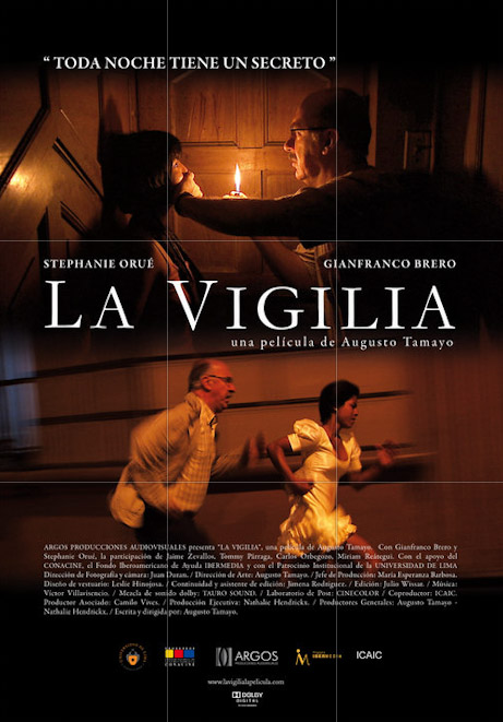
La Vigilia’s title type seems to be a very poorly-treated version of Baskerville, with uppercase “L” and “V” with small-caps, which creates a huge gap between the “L” and the “a”. The whole treatment of the title is deficient, it makes Baskerville look bad, when it’s a perfectly well-designed type.
The use of the stills doesn’t help either. The second image is so poorly shot, it’s obviously blurry due to the lack of light to freeze the actors running. And granted, both images are placed on the golden spots, but showing the actors twice is just too much. They could have just used the image of actor Gianfranco Brero and Stephanie Orue with the lighter, while cropping it as close as possible. I would even use the lighter as a teaser. The flame against the wood, and the shadows… not using them seems like a waste of textures.
Rehenes
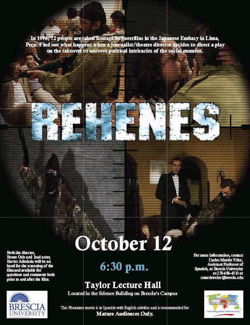
The Rehenes poster is just a downright design disaster. Not only are they centering their content, but they also dared to texturize with cheap effects their title. It’s impossible to tell what’s inside the title… smoke? Is it cheap digital rock texture? And what’s up with the texture on the film’s stills?
It’s just the perfect example of “too much”.
—
Also in Espanol over at Cinencuentro~ don’t miss the second part of the article one of these days — no, really… until Cinencuentro releases the second part ;P
So what do you think about the posters? Would you watch any of these films?

