Since I liked working on the BOUND magazine post, I decided to do one on the Revista Integracion issue, which I saw this past weekend. I’ve always been a little pissed at this magazine ever since that cover with Zhang Ziyi with the info “cover: Gong Li” or was is it the other way around? Can’t even remember now, it was so long ago. The thing was it felt like “all Chinese are the same, even for the Chinese working on this magazine.” LOL Plus, who the FUCK confuses Zhang Ziyi with Gong Li????
Integración is the local magazine, formerly known as Revista Oriental, done by the Peruvian/Chinese association… obviously to integrate the Asian community.
Only, there couldn’t be more ass-licking in a magazine like there is on this one. Trust me, the magazine is 98% photos of them and their events, than actual articles talking about Asian issues in economics, cultural or even entertainment. I’m sure as hell I haven’t ever read a review of The Curse of the Golden Flower when it opened in the city. I’m sure as hell that they didn’t mentioned that the Lima Film Festival was showing Wong Kar-Wai films in some of their events.
The bigger your stake in the magazine, the bigger the ass-lick you’ll get. Meaning, the bigger your photo will be. Trust me.
And maybe one or two pages on Korean and Japanese? Integration, my yellow ass.
Well, now that I’ve rant about content quality of the magazine, let’s talk design, shall we?

**EDIT**
decided to doodle on the cover scan so they can’t use it. LOL
So… that cover doesn’t work for me. Is it working for you? Either do a complete centered cover with the model in the middle and all composition that way, or just go the farthest from the center you can. This just looks lopsided.
I have a love/hate relationship with accents, and it’s not working for me as a brand.
Then? They’re freaking using drop shadow on their headlines. If your text is not readable without the drop shadow, you should be wondering if the photo is working for the cover, or if you should move your content around.
My advice? Since we’re not actually integrating the Korean and Japanese communities in Peru, why not DITCH the name INTEGRACION and just grab that freaking APCH logo and plaster it on the corner. ALSO… Less colors on those headlines, might be better.
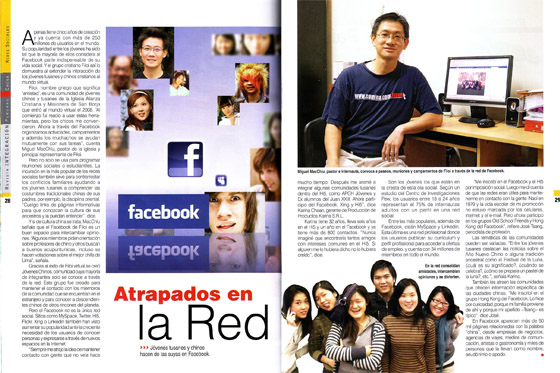
That’s one of the sample spreads. Their spreads are pretty boring… in content and design. But one of the things that popped right on my eyes was this tiny thing…

That freaking “A” is stuck to the “m” – WTF. I’ve had that happened before, but I don’t get any money from my article designs. I’ve learned to avoid this type of capitalization as of lately.
They’ve also got uneven spaces from all that Justified text, as well as one-word lines.
Then there’s the freaking image resolution. Anyone with minimum training in print design (and I’m not talking to you, I crop and colorize my photos on Photoshop “designers”) knows that you gotta at least use images with a 300dpi count. But check this image quality…



The images on the left are scanned at 100px per inch, while the ones on the right are scanned at 300px per inch. And I gotta tell you, I found over 8 photos pixelated. You can see the difference on those scans.

