BOUND is…
… lifestyle monthly with content drawn from around the globe. With the tag line “Different culture, same lifestyle”, BOUND will target female readers with in-depth features, celebrity interviews, travel editorial, fashion and lifestyle news.
or… a Lesbian magazine targeted for everyone. Or that’s what I understood from the Examiner.com ~
Or… really, another glossy.

Hot pink bubble, mine. LOL
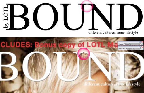
Well, typography treatment is not exactly the same, eh?

Ugly green, mine. LOL
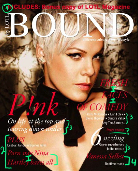
First, (1) The include message has different typography than the rest of the cover. Like, slap it on a la last minute because we want to give away this other copy of such magazine. (2) That chunk of text is TWO headlines. – 1. Lesbian Tango in Buenos Aires, 2. Porn Star Nina Hartley Bares All. Yet, it looks like #1 is the subtitle for PLUS, and #2 looks like it could be TWO headlines on their own.
(3) Look at all the fonts! And all that floating around content with no defined hierarchy. And the line-spacing… Can there be any more line-space between FRESH………… FACES……… OF COMEDY?

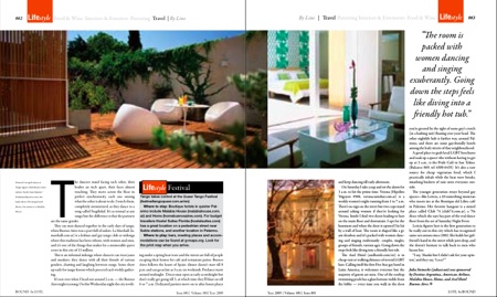
And this is too tiny to have an opinion about,
but… that “T” seems a bit clustered, right? And that line below it, I don’t think it should be there. It should be a longer line, or not be there at all. Same thing with those many ONE-word lines.

