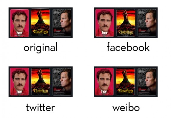
Facebook has always been crappy with most image uploads that aren’t necessarily photographs uploaded onto their albums. Forget uploading clear shapes and illustrations without adding noise to them, they’ll look pretty hideous. [example]
Recently, I noticed that Twitter had changed it’s picture upload to include the ‘:large’ suffix once you enlarge a photo to see its (Twitter max) full size. However, I also noticed a change in the way pictures are uploaded and that clear shapes and chunks of colors (hence illustrations) were also uploading in some dreadful quality. [example]
They’re especially rough on reds.
On the contrary, Weibo (instead of saying ‘a Chinese Twitter-like version’ let’s call it ‘Twitter on Steroids’) does a super (and I do mean SUPER) crisp upload, plus adding the customary Weibo URL, username and Weibo logo fix. No one can beat them. The only (kinda) sad thing about the modifications in the Weibo picture upload is that with implementations of galleries (that Facebook has also implemented not long ago), people have stopped making image collages.
If more people I knew were on Weibo, I’d be more active there.


