kawaii xD
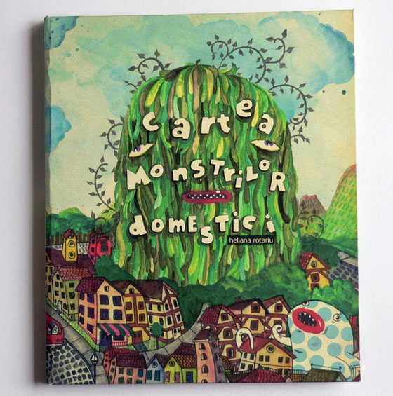
Can’t tell the language though. Is it Dutch?
I’m not very familiar with Dutch…
Take a look at all the pages through this project page.

kawaii xD

Can’t tell the language though. Is it Dutch?
I’m not very familiar with Dutch…
Take a look at all the pages through this project page.
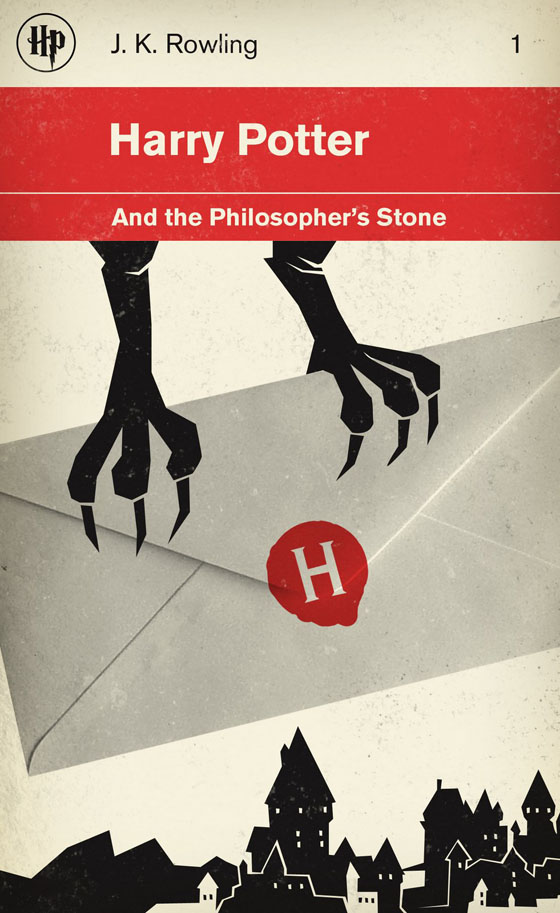
Most people know I’ve cut most (if not all) my ties with Harry Potter fandom — thank Kamisama! Where would my life be otherwise? — Anyway, I ran into these covers re-designed to look like Classic Penguin Books. These are oh so pretty!
why is that? how is that?
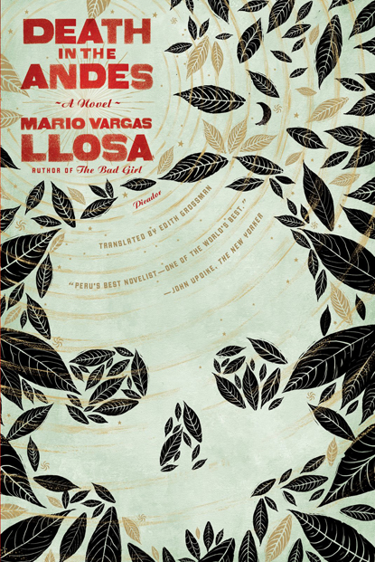
I’m not particularly fond of Mr. Vargas Llosa, but I ran into these covers, which are way cooler than the version of his books that I’ve seen lying around bookshelves.
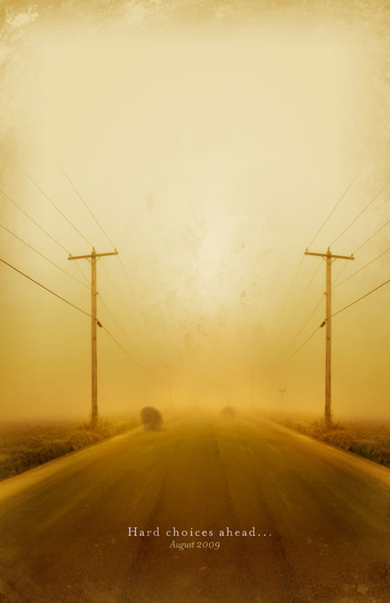
Just finished browsing through my Communication Arts issue, and ran into these posters for TCM and their classic film line up for the summer, which I thought were pretty cool.
You’ve seen this.
I’ve found a new Club Keiba CM, plus photos — and also decided to post other Club Keiba printed ads. Club Keiba should be paying me for this post, but I’m an idiot. LOL
Created by JWT making contrast between the beautiful traditional Chinese landscape paintings, and industrial living. These are gorgeous~~~

Take that Revista Integracion *laughs*

Anyway, turns out the Swedes have been doing this thing called Project China for a few years now. This year they have made a 148-page-downloadable book called “31 days of Watching China Change,” which is a far better read than anything Revista Integracion can come up with.
They talk about Economics, and how the financial crisis has affected China and its people way of thinking. They also talk about the environmental impact of the crisis in the country and overall life.
You can download the PDF from the Project China website.
Design is a bit dull though…
Overall, the marketing campaigns for everything that had to do with the Olympics was pretty awesome. China outdid itself with everything from architecture, urban design, print campaigns, tv campaigns, etc.
This particular commercial (the series of commercials, and print ads) was very moving to me. I remember the first time I saw it, it kinda made me all fuzzy inside especially when we reach the volleyball sequence, with the music and the people behind them. Very emotional.
https://www.youtube.com/watch?v=droY_91s5cU
commercial series + making of + print ads after the break~
Since I liked working on the BOUND magazine post, I decided to do one on the Revista Integracion issue, which I saw this past weekend. I’ve always been a little pissed at this magazine ever since that cover with Zhang Ziyi with the info “cover: Gong Li” or was is it the other way around? Can’t even remember now, it was so long ago. The thing was it felt like “all Chinese are the same, even for the Chinese working on this magazine.” LOL Plus, who the FUCK confuses Zhang Ziyi with Gong Li????
Integración is the local magazine, formerly known as Revista Oriental, done by the Peruvian/Chinese association… obviously to integrate the Asian community.
Only, there couldn’t be more ass-licking in a magazine like there is on this one. Trust me, the magazine is 98% photos of them and their events, than actual articles talking about Asian issues in economics, cultural or even entertainment. I’m sure as hell I haven’t ever read a review of The Curse of the Golden Flower when it opened in the city. I’m sure as hell that they didn’t mentioned that the Lima Film Festival was showing Wong Kar-Wai films in some of their events.
The bigger your stake in the magazine, the bigger the ass-lick you’ll get. Meaning, the bigger your photo will be. Trust me.
And maybe one or two pages on Korean and Japanese? Integration, my yellow ass.
Well, now that I’ve rant about content quality of the magazine, let’s talk design, shall we?
BOUND is…
… lifestyle monthly with content drawn from around the globe. With the tag line “Different culture, same lifestyle”, BOUND will target female readers with in-depth features, celebrity interviews, travel editorial, fashion and lifestyle news.
or… a Lesbian magazine targeted for everyone. Or that’s what I understood from the Examiner.com ~
Or… really, another glossy.
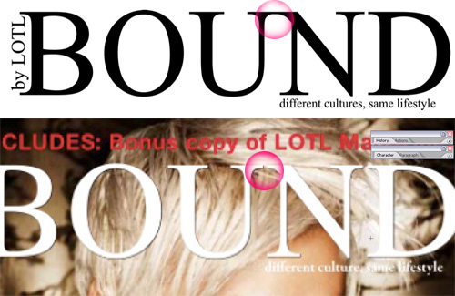
Hot pink bubble, mine. LOL
Well, typography treatment is not exactly the same, eh?