It’s winter down here. My cold resistance has gone down since my not-even-cold Canada days. I even use an electric bed warmer because my room gets so cold, it’s got a breeze with windows closed. lol Anyway, since I’m on the topic, and calling for donations to combat the winter in the South is a yearly tradition that’s never-ending, I thought I would do a post on the Tibetan heating systems. I actually only saw these on various broadcasts of -probably- CCTV’s Yuanfang de Jia (远方的家).
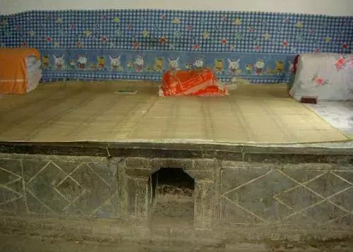
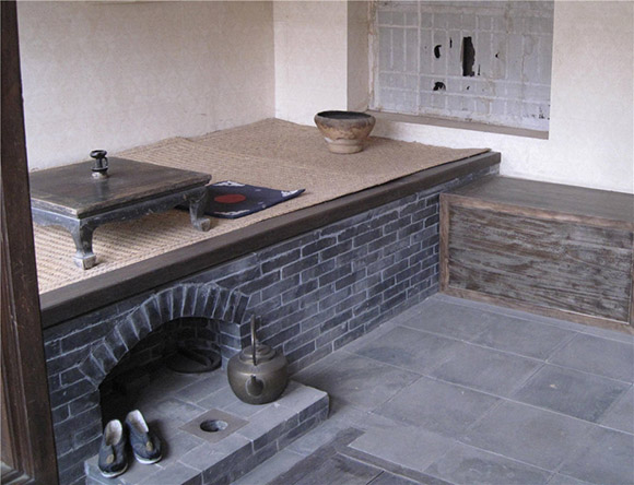
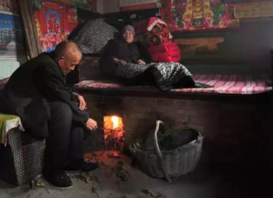
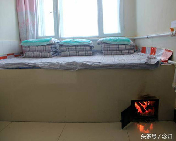
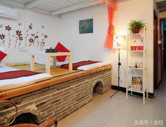
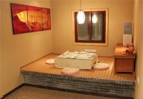
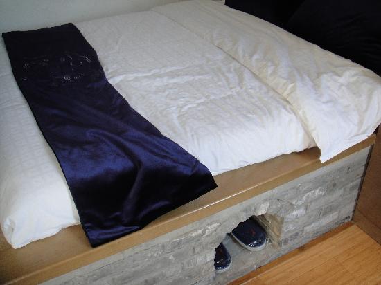
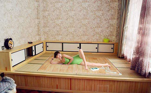
This is a Kang (炕, from the Chinese “to bake or dry by the heat of a fire“) or a “bed-stove”.
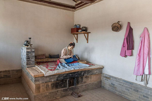
Basically, you grill yourself in winter. Like I do with my electric bed warmer. xD
Like European ceramic stoves, Korean Ondol (온돌) underfloor heating, or… well, modern heated ceramic tile floor; a Kang is designed to keep you warm, especially in cold winter nights; like it is mentioned on Coldland People (寒地百姓吟, aka. Han Di Bai Xing Yin), the Tang Dynasty poem by Meng Jiao (孟郊) that starts with the following lines:
无火炙地眠,半夜皆立号。
冷箭何处来,棘针风骚骚。
霜吹破四壁,苦痛不可逃。Translated on the Wiki page as: No fuel to heat the floor to sleep, standing and crying with cold at midnight instead.
Source: Baidu [includes a detailed explanation of the verses]
Appreciation for coal miners and heat aside; as fancy as floor-heating may look nowadays with ceramic tiles and electric heating. It all started with ovens built with brick and/or clay. A relatively more cost-efficient way to keep families in the South from freezing themselves to death.