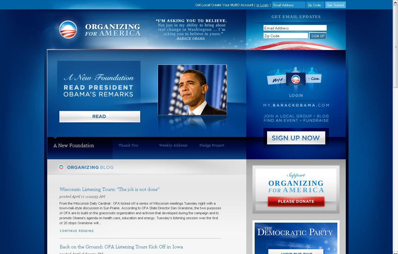
Despite whatever views I may have on Obama’s policy, decisions… or the lack of a firm position (and how much his ideas reminded me of the traditional Latin American candidates during their campaigns) – I do agree with many designers who point out how good his campaign is. The most throughly article I ever read (mind you, I read this a long time ago~~~ perhaps almost a year ago) was Expertinent: Why the Obama “Brand” Is Working – not only the thoughts and critic people involved in graphic design did, but also the comments on the article. Yes, there are a few bad-mouthing the article pointing out how they are not voting for Obama for his marketing, but there are a few others that are quite insightful too. Doing a quick search, you end up with articles such as The Hardest Working Presidential Candidate Logo, which show the pretty awesome use of the Obama-branding… crazy I tell you. As well as NOTCOT’s Obama design post, Ten marketing lessons from the Barack Obama Presidential campaign, and How Better Marketing Elected Barack Obama.
So we all agree. Now, moving on…
So I’ve been Mood: Political for the past week, and I’ve been watching a lot of political shows (which I’m tired off, because I always end up grumpy and cursing interviewers to hell and back), but I’m S&M like that sometimes~
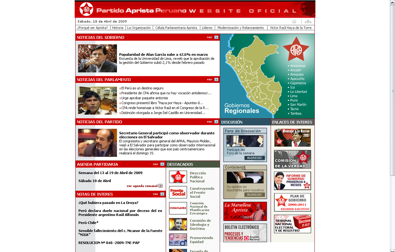
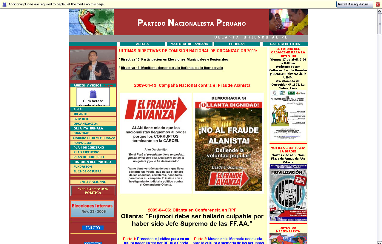
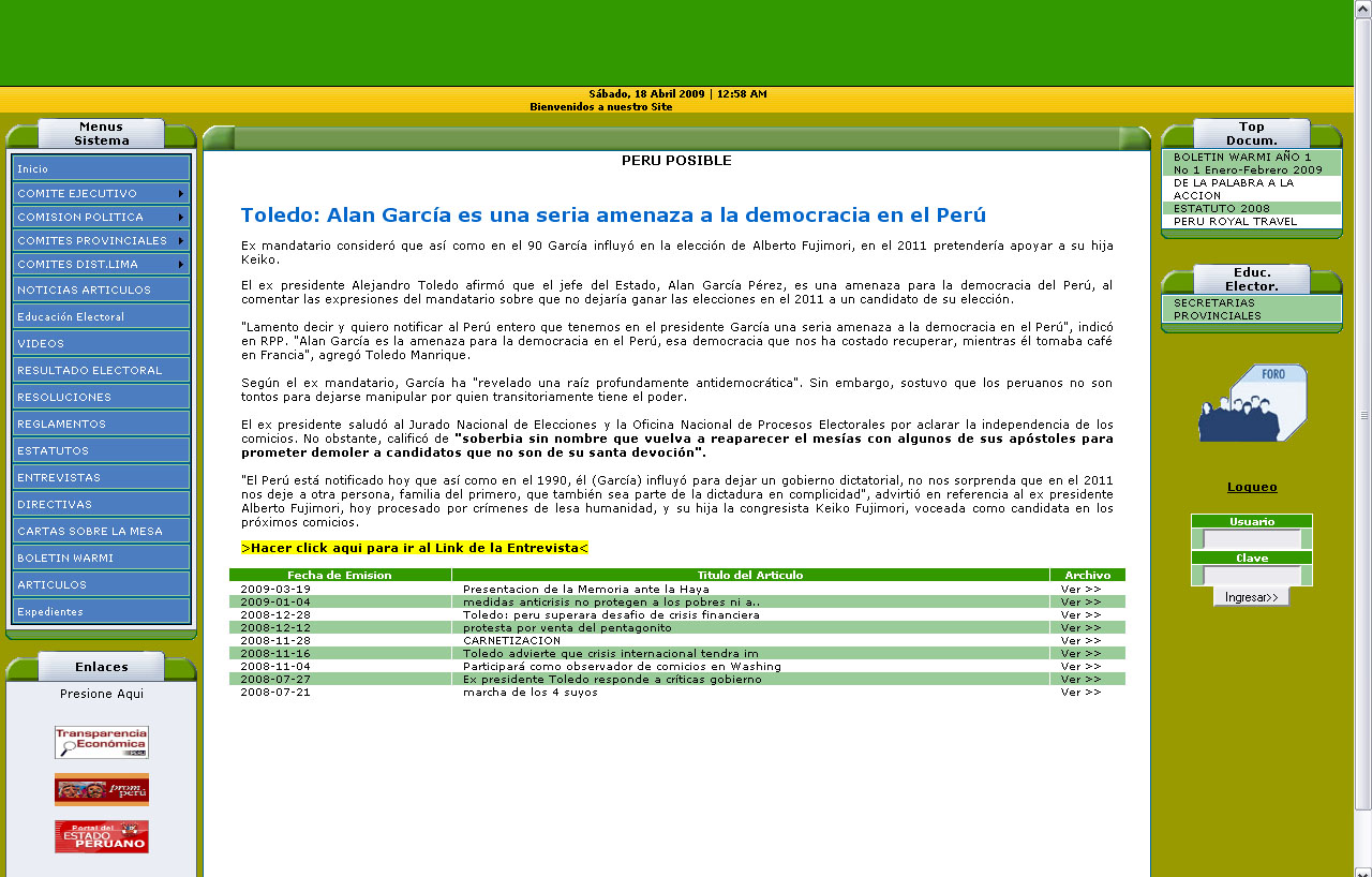
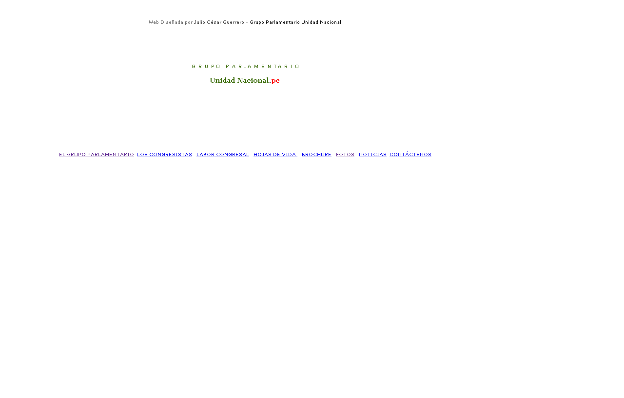
Anyway!!! I got curious, went online and looked up websites of the main political parties here in Peru. APRA, Unidad Nacional, Partido Nacionalista Peruano and… is Peru Possible still relevant? Anyway, I did search for them. I’ll just let you look at my captures instead…
Very 90’s… compared to Obama’s right? Lack of sophistication, graphical quality… but let’s even forget about apperances and focus on the content and its organization. These political Peruvian websites lack ANY information architecture, perhaps interface design needs… a lot of work?, and a total lack of interactive design. But my main problem with all of them is the amount of information, which obviously hasn’t been edited. So in short~~~ They lack structure, and they lack strong content. And don’t even mention the Unidad Nacional website which is just a placeholder saying it’s the website, it has a few links linking to .htm pages with NOTHING on them!
SHAMEFUL.
So now that we are in the Obama Era… the times of globalization, will the political parties take notice of this, and begin minding their design and content? Will good marketing finally matter here?
I may have to agree with something I remember Simon Cowell said~~ that politics in America were great because they were very engaging. Something to that extent… I remember, but can’t find the quote. LOL’ But I remember! That was the reason I watch a lot of CNN, and the voting results with their graphics. There was so much design to be seen there! And I had wished that Peruvian politics took their job that serious and stepped it up with their marketing. *sighs* If only!


 I almost never (almost sure) post fanvideos… especially if they just center on a real person, you know? I’m pretty sure I’ve never posted one… usually they make me eye-roll. It’s a whole other thing with shipping (not real people)~~ I can get a little nutz over shipping videos… though many suffer from what I’m about to describe below.