Yo! It’s pimping time!
From my comments over at Cinencuentro,
I was forwarded to this blog: DISEÑO PERU
obviously, it’s in Spanish, but it’s got great posts.
From there, a cool post on posters designed by Felipe Cortazar, who’s known for his work as a poster designer for theater releases such as the ones I’m about to show you ;P
More info (Spanish) and posters over at Diseno Peru.


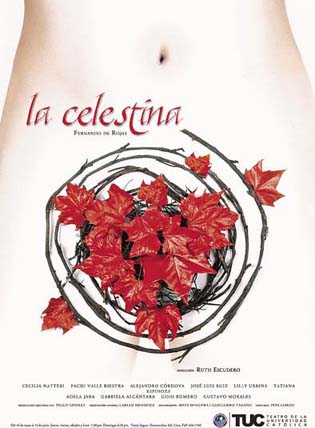
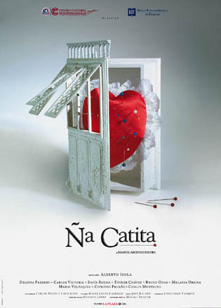
Liked the first two very much because of the use of symbolisms. They also looked like book covers (especially the second one). I think it’s because of the layout… I don’t know if is necessarily a bad thing though, cuz it works right?
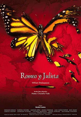
For Romeo and Juliet, I didn’t get why is it related to the Butterfly… I understand that maybe he didn’t want to go cliché and I give him props for that but I think he could have used a better image… plus I don’t know if its because of the resolution of the butterfly but to me, the butterfly against that red background doesn’t go well together. The pattern is a bit distracting and takes away from the shape of the Butterfly’s path. And also.. he could’ve worked on the kerning of the title..
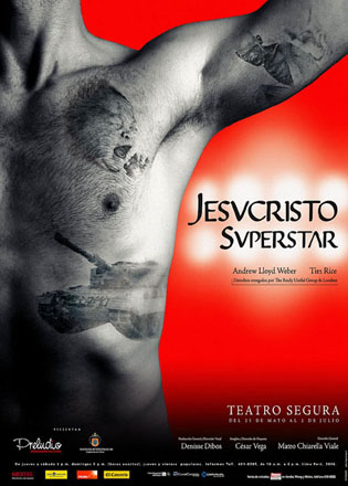
For Jesucristo Superstar… didn’t like the red background either, nor the outer glow to emphasize the type. And the left image is not working for me either… it looks like a gym-poster overall to me.
I looked at the other posters too… some were kinda cheesy to me (cof cof, the Statue of Liberty with a note). And the one for Bernarda Alba, I liked that image a lot, but the type was horrible ! the title was justified to the edges !!! And why is everything always centered?? At first i was gonna give props to that one cuz the image didn’t look center at first but then I realized it was for the way it was cropped and the proportions and positioning in relation to the space.
Interesting posters, really liked the 2 first ones, they speak without saying too much.
The two later ones were very hmmmmm.
Still Jesucristo Superstar is not really centered xD